
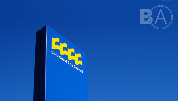
After years of unregulated signage, infrastructure, development and shire mergers, the Gold Coast City Council identity was in need of an audit and refresh to properly communicate a unified Council vision.
The challenge was to update without losing the inherit equity that was present in the existing system. While the core GCCC shape was deemed to be relatively timeless with high recall from the public, the preceding decades had seen highly inconsistent and piecemeal application of the underlying Council name and its wider uses.
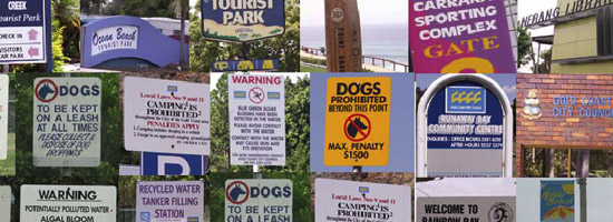
After conducting a detailed audit of the Council's touchpoints throughout its entire jurisdiction, the remedy required an overhaul and strict documentation of all supporting elements within the identity: typeface, colour palette and brandmark configuration. All specifications were chosen strategically to reproduce best on one of the Council's most visible and ubiquitous infrastructure: signage.
Supporting subgraphics were created to re-inforce the underlying shapes of the Council's visual identity, strengthening the Council visual language. New brandmark configurations were created that help the Council's image maintain its integrity in all applications. Minimum standards of manufacture were documented and circulated for Council signage applications.
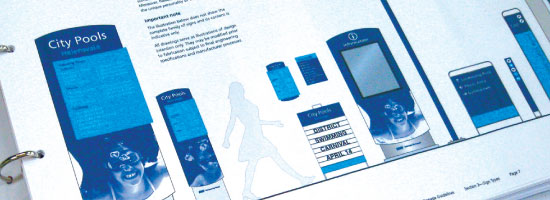
The end result is a significantly more successful branding of public Council assets. This provides a greater prominence in both the visual landscape and in public mindshare, helping communicate Council's message and ultimately enhancing the Council's return on investment.
