
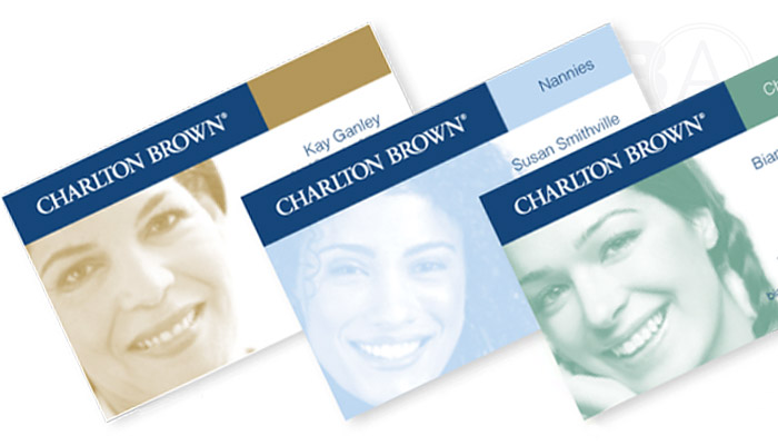
Brand Audits were commissioned to review the the Charlton Brown identity, as applied over a wide range of touchpoints and materials. These applications had evolved over many years and while some elements of the identity had been maintained effectively, other aspects showed significant room for improved consistency. By relying solely on an unremarkable colour palette for recognition, the Charlton Brown brand was not being effectively visually portrayed.
A visual identity manual was developed that provided a clear and consistent guide for the use of the identity. This set of core guidelines ratified the high-level company strategy into documented minimum standards for colour, typography, photography and other imagery. While the pre-exiting colour palette was retained, the visual focus was adjusted and logo created to help create a unique and differentiated brand in the market.
