
Queensland Performing Arts Centre (QPAC) is Queensland’s premier entertainment destination. Playing host annually to nearly three quarters of a million people, QPAC is an integral part of the arts community and a leading presenter of performing arts in the Asia-Pacific region.
Despite the considerable role that QPAC plays in Australia’s cultural landscape, their projected identity did not sustain the equivalent level of market recognition. A more effective system was needed to communicate what QPAC was about and what QPAC stood for (both figuritively and, especially for the international market, literally).
The static and heavy design of QPAC’s previous wordmark was replaced with a dynamic graphic (the signature) inspired by a dancer across a stage or a performing musician. A vivid, rotating colour palette was developed and a number of prescribed relationships of the signature and the centre’s name in full were designed for use in all applications. This all helps ensure the QPAC message is effectively communicated every time.
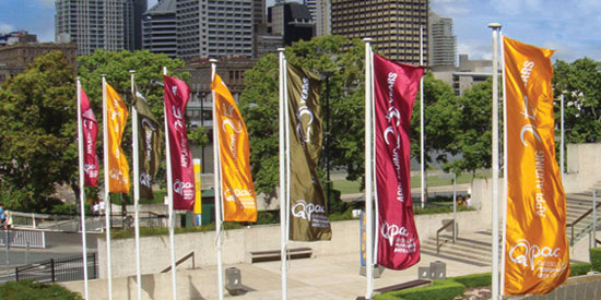
QPAC launched their new visual identity in conjunction with their 25th year celebrations. Celebratory graphics were created for use throughout the year, and a series of artwork and layout guidelines have given QPAC a consistent and recognisable look to all of their printed materials. New layout quidelines inspired directly by the centre' iconic architectural features utilise the unique visual language of the building itself, increasing brand recognition and aiding increased public awareness.
